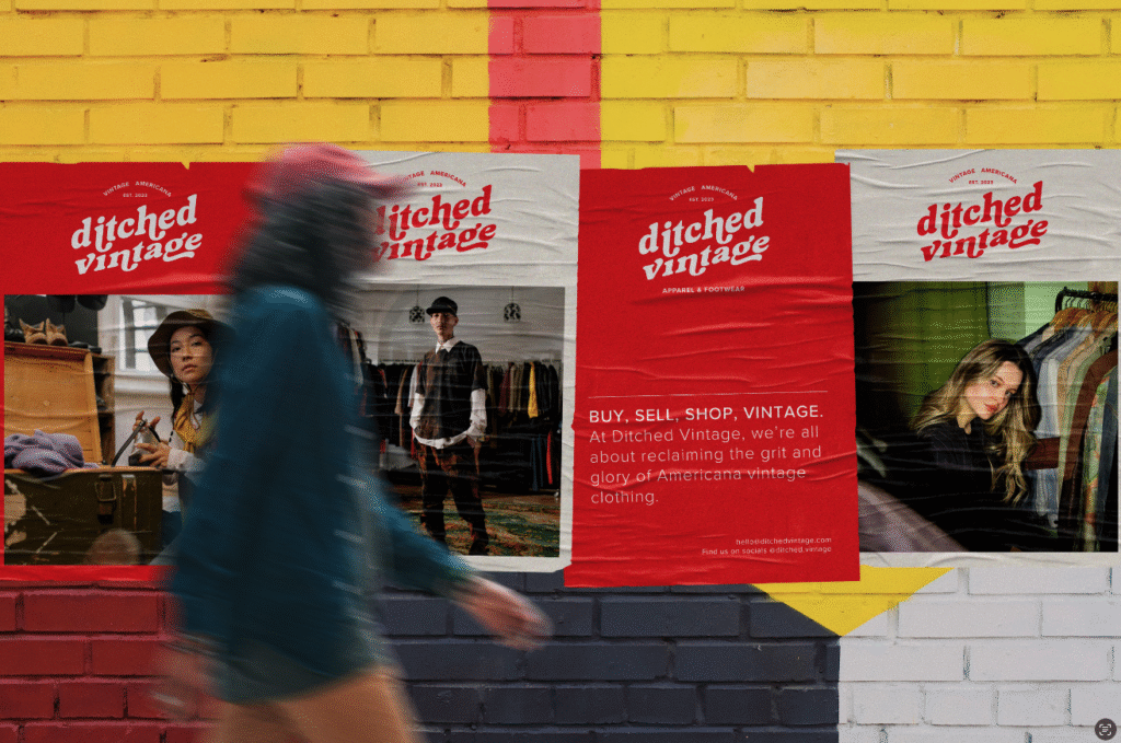
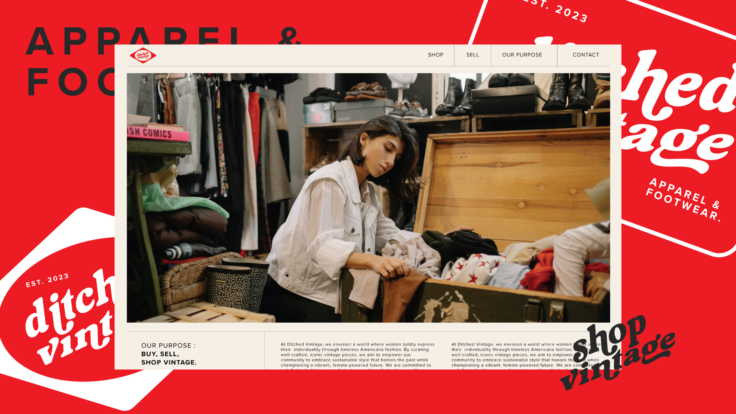
Ditched Vintage is a family-run, edgy vintage retailer blending industrial Australian grit with high-energy Americana nostalgia. As their store grew in popularity, they needed a brand system that matched the excitement, personality, and momentum happening on the ground, something more recognizable and versatile than their original DIY identity.
We built a bold, cohesive visual language centered around a striking red that grabs attention from the street and invites curiosity. This energetic palette, paired with punchy, cohesive typography and vintage-inspired styling, creates instant recognition. The result feels authentic, gritty, and alive, and that signature red has become a magnet, drawing shoppers in and sparking conversations before they even walk through the door.