A Personal, Hand-Crafted Identity for a Local Builder
Branding
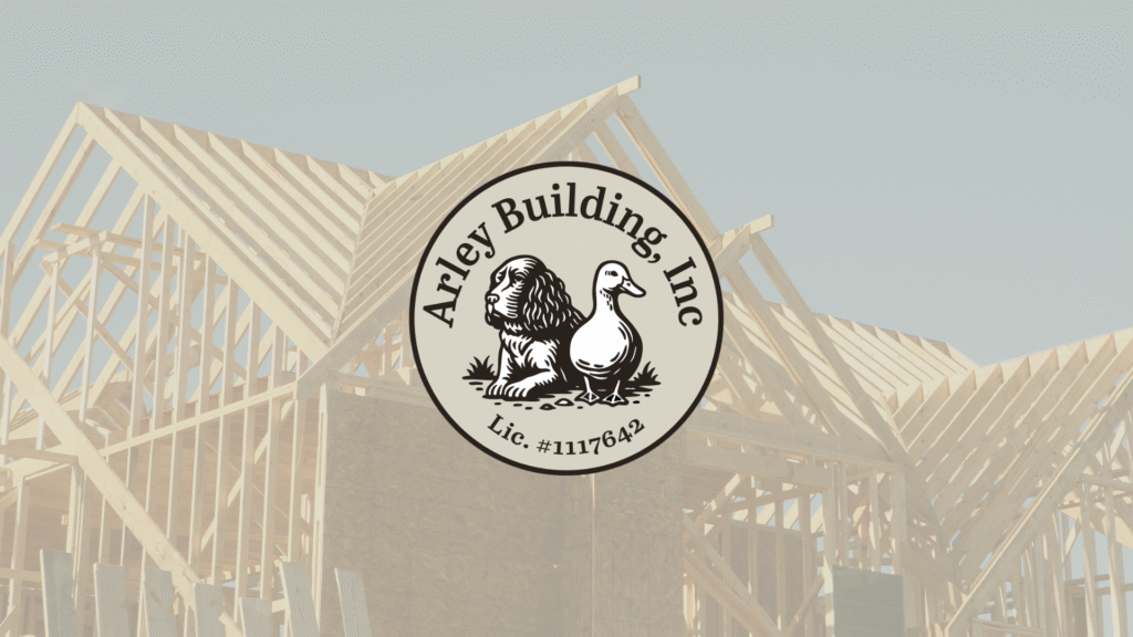
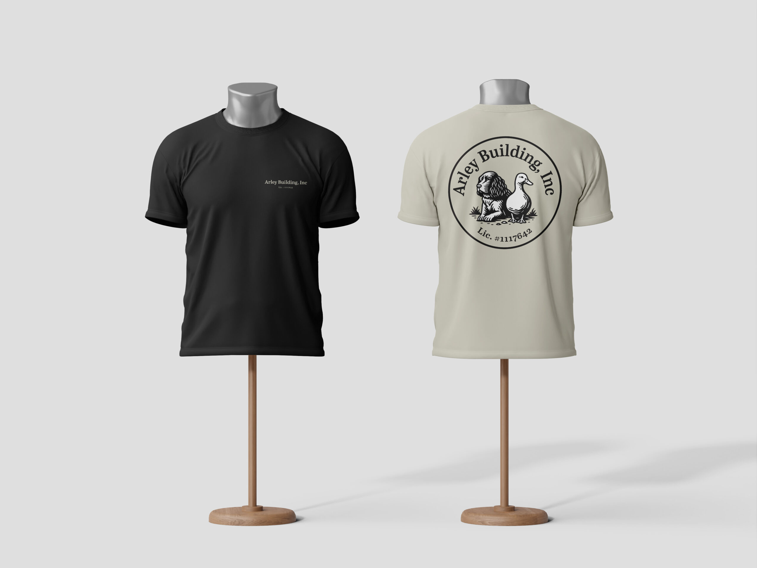
Arthur & Ripley is a California-based general contracting business that wanted a brand as unique and approachable as its owner. In a field crowded with cookie-cutter, corporate, hammer-logo-style branding, he wanted something meaningful, inspired by the two animals he brings everywhere: his Springer Spaniel and his Pekin Duck.
We leaned into emotional branding and crafted a coin-style emblem featuring his two animal companions, paired with a modern serif to nod to craftsmanship and tradition. The identity feels personal, warm, and rooted in community, a clear contrast to big-firm builder branding. Since launch, the personality-driven concept has sparked interest from other local trades wanting to lean into more authentic, story-led branding, proving that human connection still builds the strongest foundations.